4 rules to build the perfect splash page for your WiFi hotspot
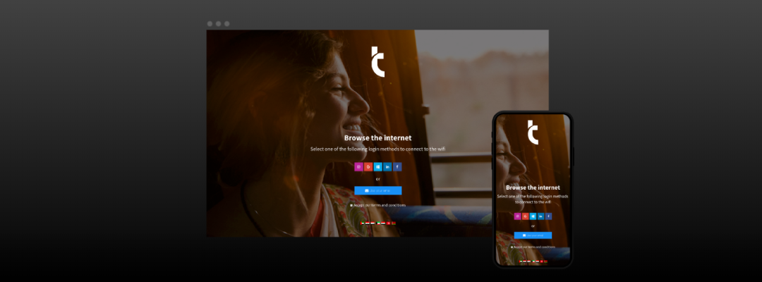
Tanaza features a splash page editor that allows in few minutes the WiFi network administrator to create and customise the authentication page of a public hotspot. In this article, you will find the 4 rules to create an effective splash page for your WiFi users in order to leverage your WiFi network.
Easy and fast access to the WiFi network
When users visualise the splash page, you have a few seconds to convince them to log in. Accessing your public hotspot should not require too many efforts otherwise, you are taking the risk to loose potential WiFi users.
The best way to obtain an effective splash page is to make it simple and easy to use.
Don’t add too many items, focus on the essential
When creating a splash page, be careful not to confound simplicity with shortage otherwise, you could lose WiFi users with too many information on the landing page. This happens because we don’t respect a few design rules.
But which are these four design rules for an effective splash page?
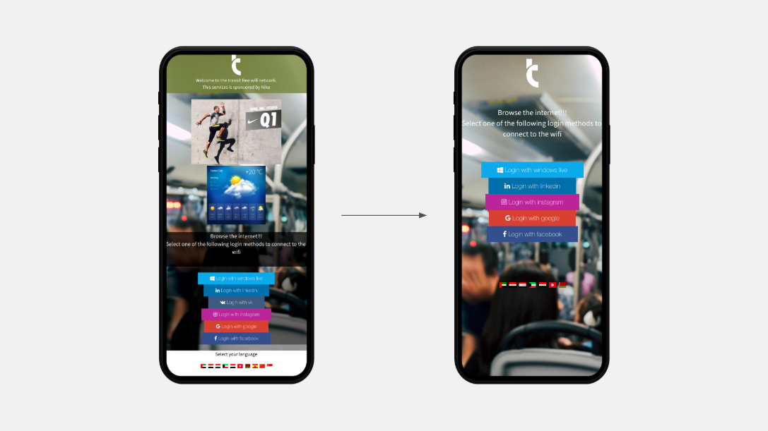
1. Do not add too much content to the WiFi splash page
Less is more is the universal good design rule.
By putting just a few contents in the splash page you allow them to focus on the essentials items and you make the UI intuitive and immediate. When users click on your WiFi network name to access the internet, they expect a fast and easy way to log in.
Instead, they often deal with too complex pages, with too much information, which makes the login process too long and complex.
Add to the WiFi splash page only the essential items: logo, a welcome text, a few login methods. If you need users to accept your terms and conditions, ask your legal consultant to reduce the amount of text to a minimum (eventually link to the full text of terms and conditions).
2. Use a few colours in your WiFi splash page
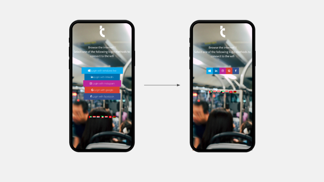
The human mind needs time to elaborate the information, and this takes some effort. A splash page with five colours is more complex to understand than one with just one or two colours. Using a few colours, you allow users to relax and focus, making the WiFi access easier.
Choose monochromatic backgrounds or simple images, with just a few items and a uniform colour set. If you use many login methods (e.g. three social login methods) reduce the amount of space that each button takes, so that the page is less coloured.
3. Focus the attention on key elements
To make your splash page more intuitive, use some tricks to focus users on the most important elements.
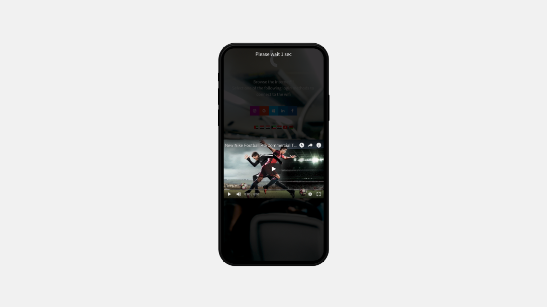
Use the advertising tool to publish ads on your WiFi splash page
Use the Tanaza advertising tool to show advertising banners and videos. This way, you will focus your users’ attention on the show!
Use bold for titles
Help users to quickly examine the content in your page. Bold your titles (the most important message) and eventually complete the message with a normally formatted text. Using bold titles helps users read your message and login instructions.
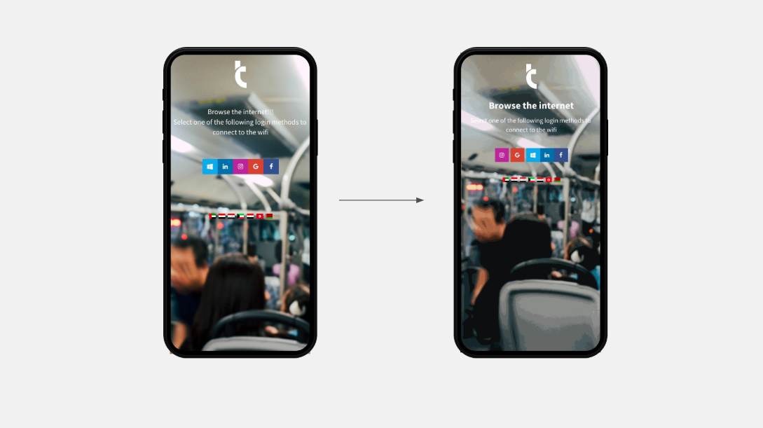
Put some space between the elements
As in a book, distinguish the various elements in the splash page with some space and interline. Using white space helps to focus the users’ attention on single elements, such as your logo, text, or buttons.
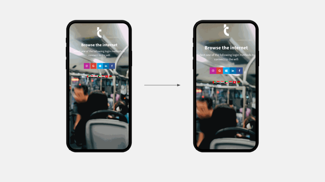
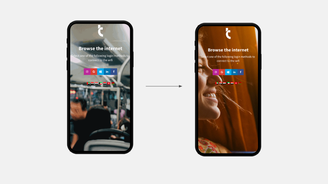
Use images with a clear meaning
Don’t use images as a decoration, instead choose images that reflect the message you want to send and your brand image. Or, use them to drive emotions (e.g. the image of a smile, or a sunset).
4. Make your Wifi login page accessible
Make your WiFi splash page easy to access for anyone. Small text fonts, clear colours, or small buttons (hard to click from mobile devices) make the login experience too complex for someone.
How to make a WiFi splash page accessible?
Make the text readable
Use a larger font size, at least 20pt. Don’t try to be original by using complex font, for example, a font simulating handwriting, as they are less easy to read and less intuitive.
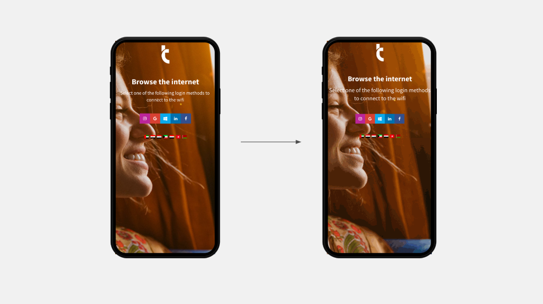
Create some contrast
Use a clear colour for text on a dark background, or the opposite. Create contrast by making the whole page clearer or darker and don’t use coloured rectangles under the text.
Create contrast between elements: if you use blue login buttons, use a red or yellow background.
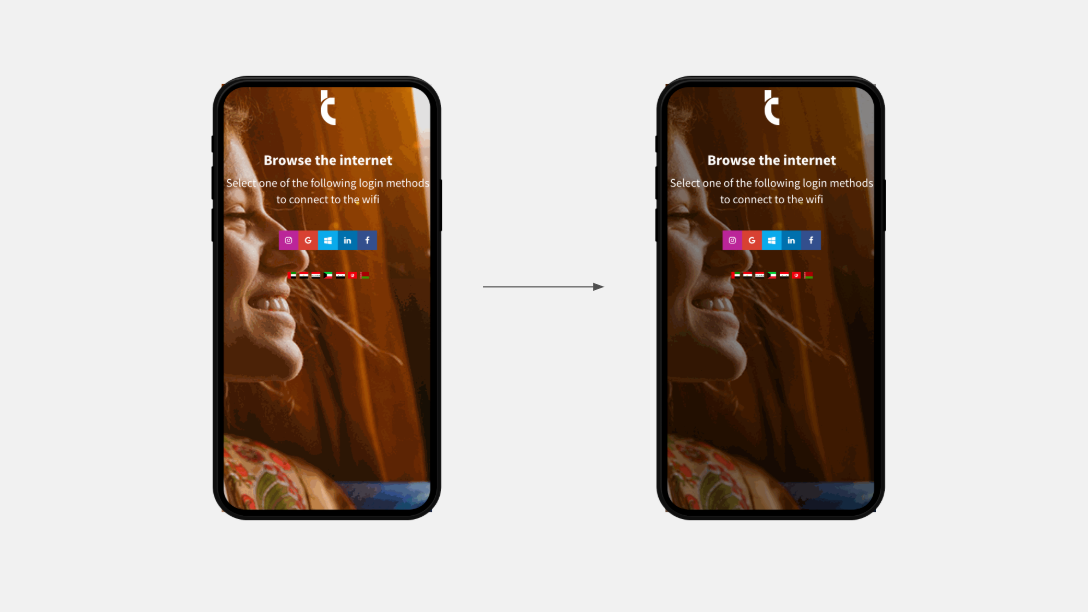
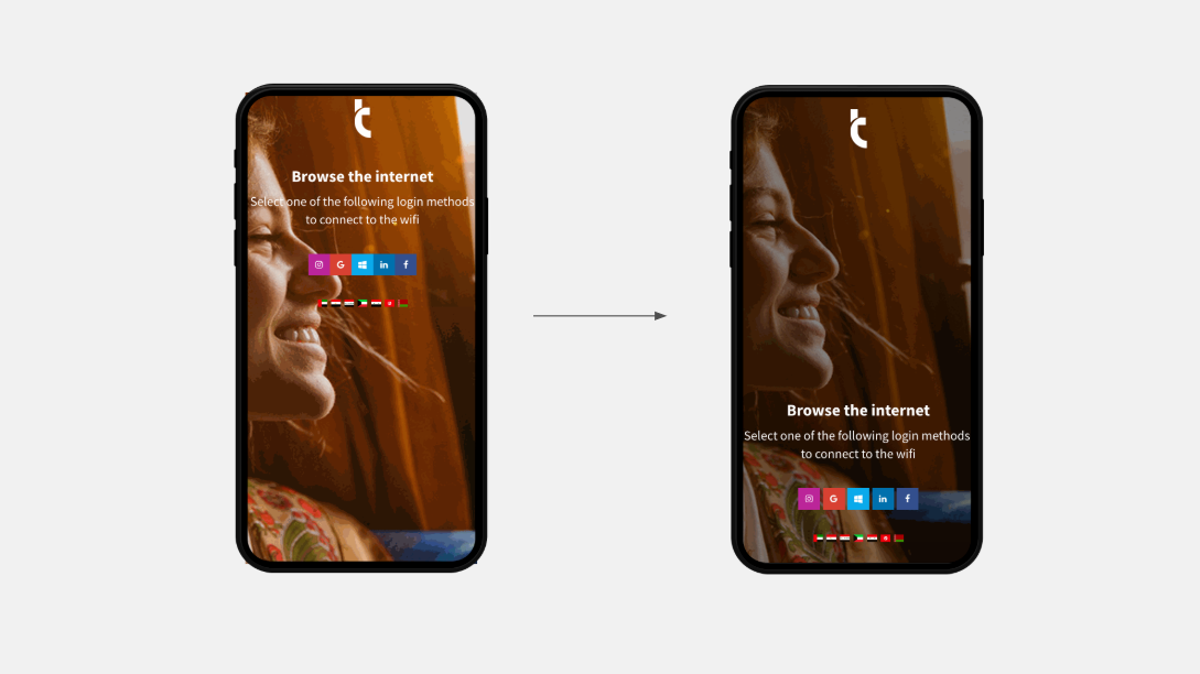
Move buttons to the bottom
Make the experience better for mobile device users. Put the elements at the bottom by using the footer component in the Tanaza splash page editor, you’ll make the click from mobile devices easier.
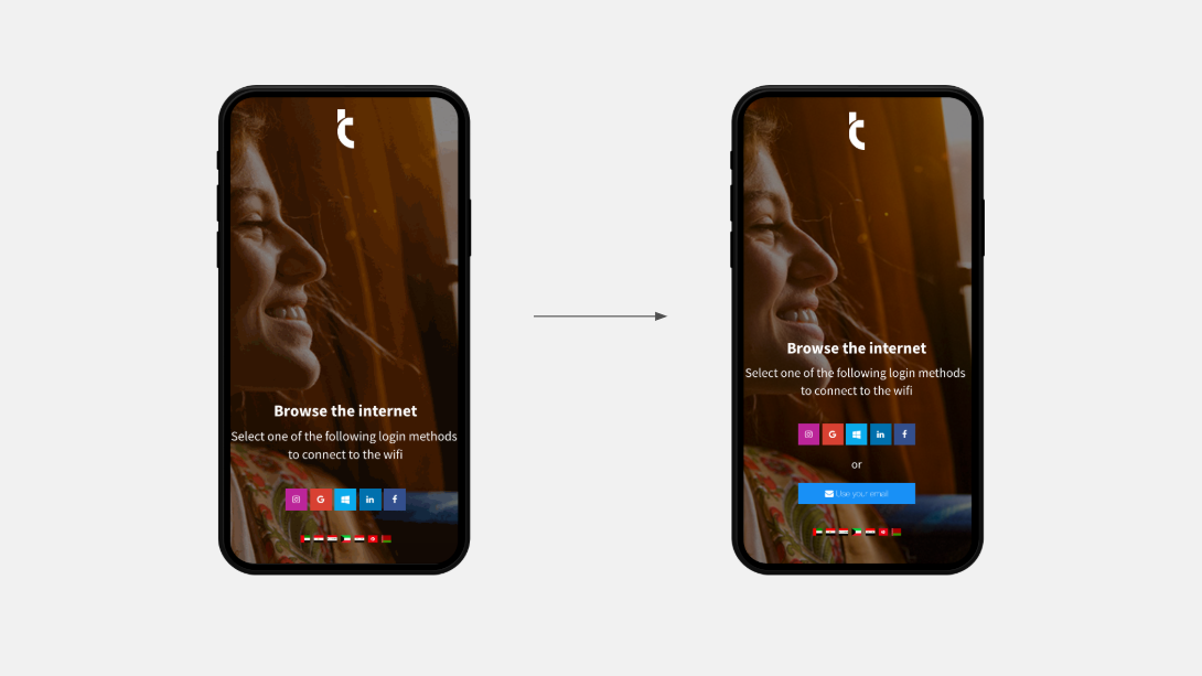
Offer a way-out
If you use a social login method, offer an alternative method of authentication via email. Not all people have a social account or want to use it; some might prefer the email, instead.
Conclusion
Creating an effective splash page is not hard. Do not fill it with stuff: use just a few images, a few colours, a small amount of text and a few login methods.
Focus the attention on the key elements and make the UI simple, by using less colours. Make it also accessible, by using a large font size, contract, and moving buttons to the bottom.
If you want to collect users’ data through WiFi, use social login together with another authentication method such as the email login.
If you want to comment on this article, for example by adding your own examples of splash pages, we’ll be happy to provide some feedback!
